Why Most QR Codes Look the Same — and Why That Matters
Walk into any restaurant, store, or event, and you'll see the same thing: plain black-and-white QR codes stuck on tables, doors, and posters. They all look the same. They all blend together. And most people scan them without even noticing whose brand they're engaging with. If your QR code looks like every other QR code, you're missing a massive branding opportunity.
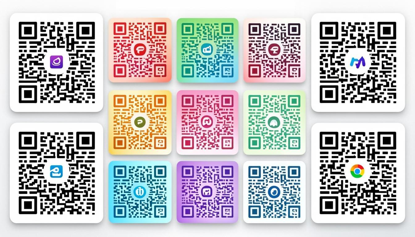
QR codes are touchpoints. Every time someone scans your code, they're interacting with your brand — but a generic black-and-white square communicates nothing. No personality. No trust. No recognition. Meanwhile, a custom QR code with your brand colors, logo, and styling turns a forgettable scan into a memorable brand moment. The difference isn't just aesthetic — it's measurable. Research from QR code marketing platforms indicates that customized QR codes receive significantly more scans than standard black-and-white ones, simply because they stand out and build trust.
The Science Behind QR Code Scan Rates
Why do custom QR codes get more scans? It comes down to three psychological factors:
- Visual salience: The human brain is wired to notice things that break patterns. A sea of black-and-white squares all look identical — but a QR code with brand colors, a logo, or a custom frame immediately grabs attention. In environments where multiple QR codes compete (trade shows, menus, storefronts), the one that looks different wins the scan.
- Trust signaling: A branded QR code signals legitimacy. When people see a logo they recognize inside a QR code, they feel safer scanning it. A plain, unbranded QR code could belong to anyone — and in an age of phishing and QR code risks, trust matters more than ever. Read our guide on QR code security for more on this topic.
- Call-to-action clarity: Custom frames with text like "Scan for Menu" or "Scan to Pay" remove ambiguity. People are more likely to scan when they know exactly what they'll get. This is behavioral design 101 — reduce friction, increase action.
Research supports this. Studies have found that branded QR codes with logos see significantly higher scan-through rates compared to plain codes, and custom QR codes on product packaging consistently drive more engagement than unbranded ones. The bottom line: design isn't decoration — it's a performance multiplier.
Customization Options in QREndlessPro
The QR Code Customizer gives you full creative control over every visual element. Here's what you can customize:
Brand Colors
QR codes don't have to be black and white. You can use any colors as long as there's sufficient contrast between the foreground (data modules) and background. QREndlessPro offers 30+ preset color combinations designed for optimal contrast, or you can set custom foreground and background colors. The key rules:
- Dark foreground on light background works best for scanning reliability
- Maintain a contrast ratio of at least 4:1 between foreground and background
- Avoid very light colors for data modules — they won't scan reliably under varied lighting
- Test your color choices on actual devices before committing to print
Logo Embedding
Adding your logo to the center of a QR code makes it instantly recognizable and builds brand trust. When someone sees your logo inside the QR code, they know exactly who it belongs to and feel confident scanning it. Key considerations:
- Keep the logo size under 20-25% of the QR code area to preserve scannability
- Use Level H error correction (30% recovery) to compensate for the modules covered by the logo
- Leave a quiet zone (white border) around the logo so it doesn't bleed into the data area
- Test on multiple devices after adding the logo — this is non-negotiable
Gradient Fills
Linear and radial gradients add depth and visual interest to QR codes, making them look more polished and professional. QREndlessPro supports two gradient types:
- Linear gradients: Smooth color transitions from one side to another — great for brand color flows
- Radial gradients: Color radiating from the center outward — creates a spotlight effect that draws the eye
- Always ensure the gradient doesn't reduce contrast below the 4:1 threshold at any point
- Gradients work best with medium-to-large QR codes (300px+ for digital, 3cm+ for print)
67 Custom Dot Styles
The individual squares (modules) in a QR code can be styled in 67 different shapes. This is one of the most impactful design choices — the dot style defines the entire visual character of your QR code:
- Classic shapes: Rounded squares, circles, diamonds, hexagons
- Organic shapes: Dots, rounded dots, and natural forms
- Expressive shapes: Star, heart, cross, and themed shapes
- Geometric patterns: Octagons, triangles, and tessellated forms
Each style is engineered to maintain scannability while giving your QR code a completely unique look. The dot style is the single fastest way to make a QR code feel custom without touching colors or logos.
55 Finder Styles
The finder patterns — those three large squares in the corners — are what scanners use to locate and orient the QR code. QREndlessPro offers 55 different finder styles so even these structural elements can match your brand aesthetic. From rounded corners to circular finders to decorative frames, you can style the most visible part of the QR code without compromising scan reliability.
25 SVG Frames
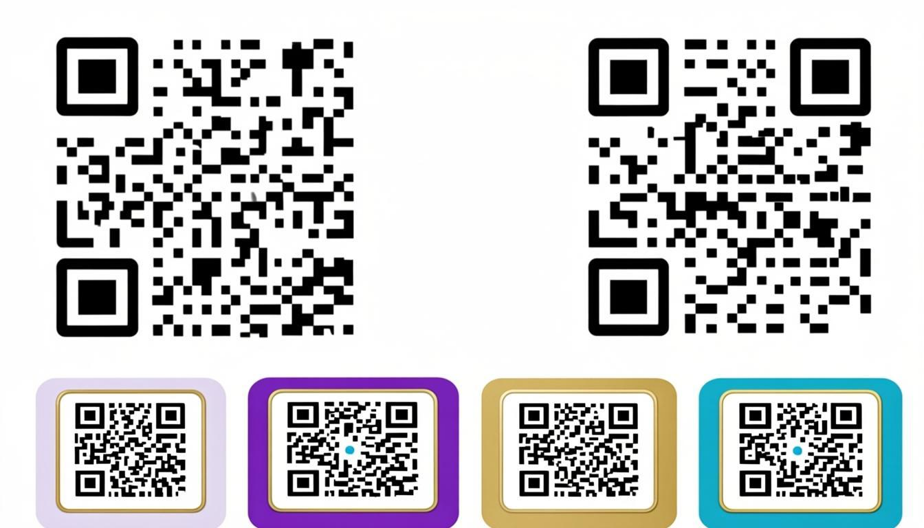
Frames serve dual purposes: they add visual appeal and provide a built-in call-to-action. QREndlessPro offers 25 SVG frame templates with customizable text, colors, and shapes. Effective frame designs include:
- Clear call-to-action text ("Scan Me", "Scan to Pay", "Scan for Menu")
- Brand-consistent colors and styling that match your visual identity
- Proper quiet zone between the frame and QR code to ensure reliable scanning
- Scalable SVG output so frames look crisp at any print size
7 Export Formats for Every Use Case
Once you've designed your custom QR code, you need it in the right format. QREndlessPro supports 7 export formats — more than any other free QR code tool:
- PNG (4K resolution): Best for digital display, websites, social media, and presentations
- JPG: Universal compatibility for email signatures, documents, and legacy systems
- WebP: Modern web format with smaller file sizes — ideal for web performance
- Transparent (no background): Overlay your QR code on any surface, photo, or design without a white box
- SVG (vector): Infinitely scalable for print — business cards, billboards, packaging, anything
- PDF (print-ready): Press-quality output for professional printing workflows
- EPS (professional print): Industry-standard format for commercial printers and sign shops
For print, always use SVG, PDF, or EPS. For digital, PNG or WebP. For overlaying on designs, Transparent. Every format is free, no watermarks, no sign-up.
Design Best Practices: Do's and Don'ts
Do's
- Use high error correction (Level H) for designed QR codes — it compensates for the visual modifications
- Test your QR code on at least 3 different devices before printing or distributing
- Keep sufficient contrast between foreground and background — at least 4:1 ratio
- Add a clear call-to-action near or on the QR code (using frames)
- Use SVG, PDF, or EPS format for anything that will be printed
- Include a quiet zone (4-module white border) around the QR code
- Start with the QR Code Generator at Level H error correction, then customize in the Customizer
Don'ts
- Don't stretch or distort the QR code aspect ratio — it must remain a perfect square
- Don't use reflective materials that create glare when printing
- Don't place QR codes on curved surfaces without testing — distortion can break scanning
- Don't use colors that are too similar for foreground and background — low contrast kills scannability
- Don't cover finder patterns (the three corner squares) with design elements
- Don't reduce the printed size below 2cm x 2cm — smaller codes are unreliable
- Don't use Level L error correction for designed QR codes — you need the recovery capacity
Design Inspiration by Industry
Not sure where to start? Here are creative QR code design ideas tailored to specific industries:
Restaurants and Cafés
Use warm colors (deep reds, oranges, earth tones) that match your restaurant's ambiance. Add your logo to the center and use a frame that says "Scan for Menu." Rounded dot styles feel friendly and approachable. Place the QR code on table tents, coasters, and at the host stand. For digital menus, generate a URL QR code first with the Generator, then customize it to match your brand.
Technology and SaaS
Lean into modern aesthetics — gradient fills in your brand colors, clean geometric dot styles (hexagons, diamonds), and minimalist finder patterns. Use a Transparent export so the QR code overlays cleanly on your website or app. For product packaging, export as SVG for crisp print at any size. A custom QR code on your landing page or product box signals that you care about details.
Fashion and Retail
Think editorial — elegant dot styles (circles, rounded dots), subtle gradients, and frames that match your seasonal campaigns. Use the Transparent export to overlay QR codes on product photos and lookbooks. For hang tags and labels, use the PDF or EPS format for high-quality print. Your QR code should feel like an extension of your visual identity, not an afterthought.
Events and Conferences
Go bold — high-contrast colors, large custom frames with clear CTAs ("Scan to Register", "Scan for Schedule"), and dot styles that are easy to scan from a distance. Events are high-competition environments where dozens of QR codes compete for attention. The one that stands out gets scanned. Use the Bulk Generator to create unique QR codes for each attendee, then customize them with event branding.
How to Test Your Custom QR Code
Design is only valuable if the code actually scans. Here's a practical testing workflow:
- Test during design: Use the QR Code Scanner to scan your custom QR code directly from the screen. If it doesn't scan on screen, it won't scan in print.
- Test on multiple devices: Scan with at least 3 different phones — an iPhone, an Android, and an older device. Older cameras are less forgiving of low contrast or unusual dot styles.
- Test at actual size: Print the QR code at the exact size you plan to use and scan it from the expected scanning distance. A QR code that scans at 10cm on screen may not scan at 2cm on a business card.
- Test under real conditions: Scan in different lighting — bright sunlight, dim restaurant, fluorescent office. Light conditions affect contrast perception.
- Test with the QR Code Decoder: Upload a photo of your printed QR code to verify that the decoded data matches exactly what you encoded.
- Test after every design change: Changed a color? Added a logo? Switched dot styles? Test again. Every modification has the potential to affect scannability.
If your custom QR code fails any test, adjust the design: increase contrast, reduce logo size, switch to a simpler dot style, or increase error correction to Level H. Then test again.
Creating Professional QR Codes with QREndlessPro
The best workflow for branded QR codes is a two-step process:
- Generate: Create your QR code with the Free QR Code Generator using any of 1,421+ data types and Level H error correction
- Customize: Open the QR Code Customizer to add your brand elements — choose from 67 dot styles, 55 finder styles, 25 SVG frames, custom colors, gradients, and your logo
Every customization option is free — no premium tiers, no watermarks, no sign-up required. Export in any of 7 formats, including 4K PNG for digital and SVG for print. Start creating branded QR codes at qrendless.pro/customize. For more on generating QR codes, see our Free QR Code Generator guide.
Frequently Asked Questions
Can I add my logo to a QR code without breaking it?
Yes, as long as you use Level H error correction (30% recovery) and keep the logo under 20-25% of the QR code area. Level H compensates for the data modules covered by the logo. Generate your QR code with Level H using the Generator, then add your logo in the Customizer. Always test on multiple devices after adding the logo.
What colors work best for QR codes?
Dark foreground on light background is the safest choice. The contrast ratio between foreground and background should be at least 4:1. Avoid very light colors for data modules (they won't scan reliably) and avoid using similar colors for both foreground and background. QREndlessPro's 30+ preset color combinations are all designed to meet this threshold.
How many dot styles does QREndlessPro offer?
QREndlessPro offers 67 dot styles and 55 finder styles. Dot styles range from classic squares and circles to expressive shapes like stars, hearts, and hexagons. Finder styles let you customize the corner patterns that scanners use to locate the QR code. Every style is designed to maintain scannability while giving your QR code a unique look.
Do custom QR codes scan as reliably as standard ones?
Yes, when designed correctly. The key factors are: sufficient contrast (4:1+ ratio), Level H error correction, logo size under 20-25% of the QR code area, and a proper quiet zone. If you follow the design best practices in this article, a custom QR code will scan just as reliably as a plain black-and-white one — and get more scans because people actually notice it.
What export format should I use for my custom QR code?
For digital use (websites, social media, email), use PNG (4K) or WebP. For print, use SVG, PDF, or EPS — these are vector formats that scale perfectly to any size. For overlaying on designs or photos, use the Transparent format (no background). QREndlessPro supports all 7 formats with no watermarks or restrictions.
How do I test whether my custom QR code works?
Use the QR Code Scanner to scan from your screen, then print at actual size and test on multiple devices. For extra verification, upload a photo of your printed QR code to the Decoder to confirm the decoded data matches. Test under different lighting conditions and at the expected scanning distance. If it fails, increase contrast, reduce logo size, or switch to Level H error correction.